The Washington Post Video Redesign
INTRO TO THE PROJECT
In early 2017, I proposed to the editorial director of video that we start looking into the idea of hiring an outside agency to redesign our various video franchises.
Once I got the initial go-ahead, I started reaching out to design agencies who had experience in online video. After many conversations we decided to work with a creative production studio from New York City called Versus.
SOLUTION TO A PROBLEM

Before 2017, The Post’s video team produced breaking news video, enterprise content, explainers, live video, and 360 video all in-house. In 2017, we were looking to add franchises, scripted series, longer-form journalism, and personality-driven content into the mix. And we were doubling the video staff. That presented us with a big problem.
How do we keep all of that work…consistent? What does it even look like? How do we tell the 30 or so new people joining the video team what we are doing?
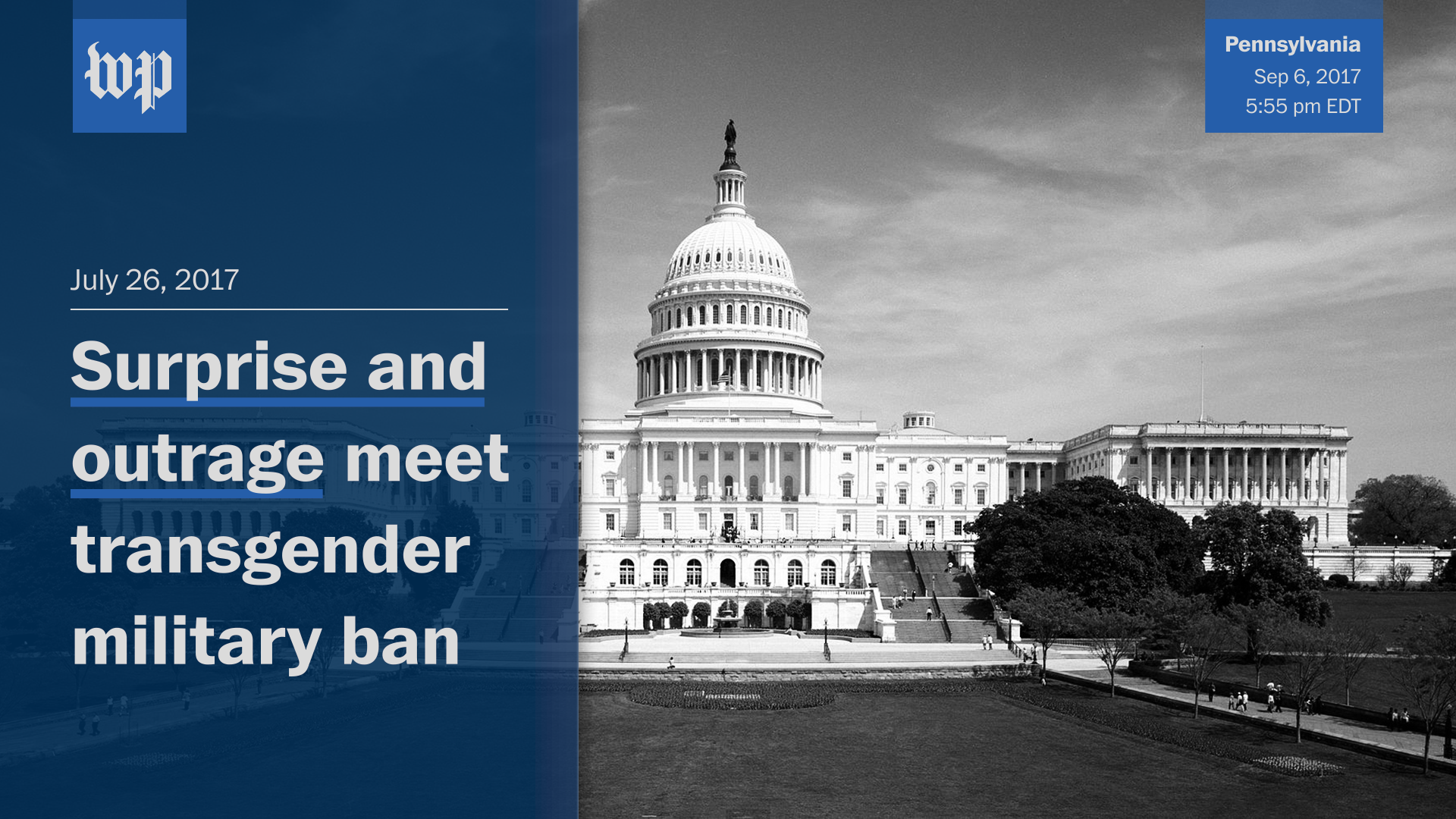
This project was the solution to that problem. It’s purpose was to answer that very important question “What does a Washington Post video look like?”. A question that took on more importance after Vox.com launched with such a unique and distinct aesthetic.
NOT JUST GRAPHICS
An important point I made during my initial pitch for this idea was that this redesign was not just about visuals. It was also about strategy, editing, workflow, training, workshopping, etc. It was a top-to-bottom evaluation of what we’re doing and why we’re doing it. And then at the end of this process, we document everything. We write down our secret sauce. When a new employee starts, they are given this brand bible to study. As time goes on, the brand bible grows to include various examples of how we do video here at the Washington Post.
PREVIOUS BRANDING


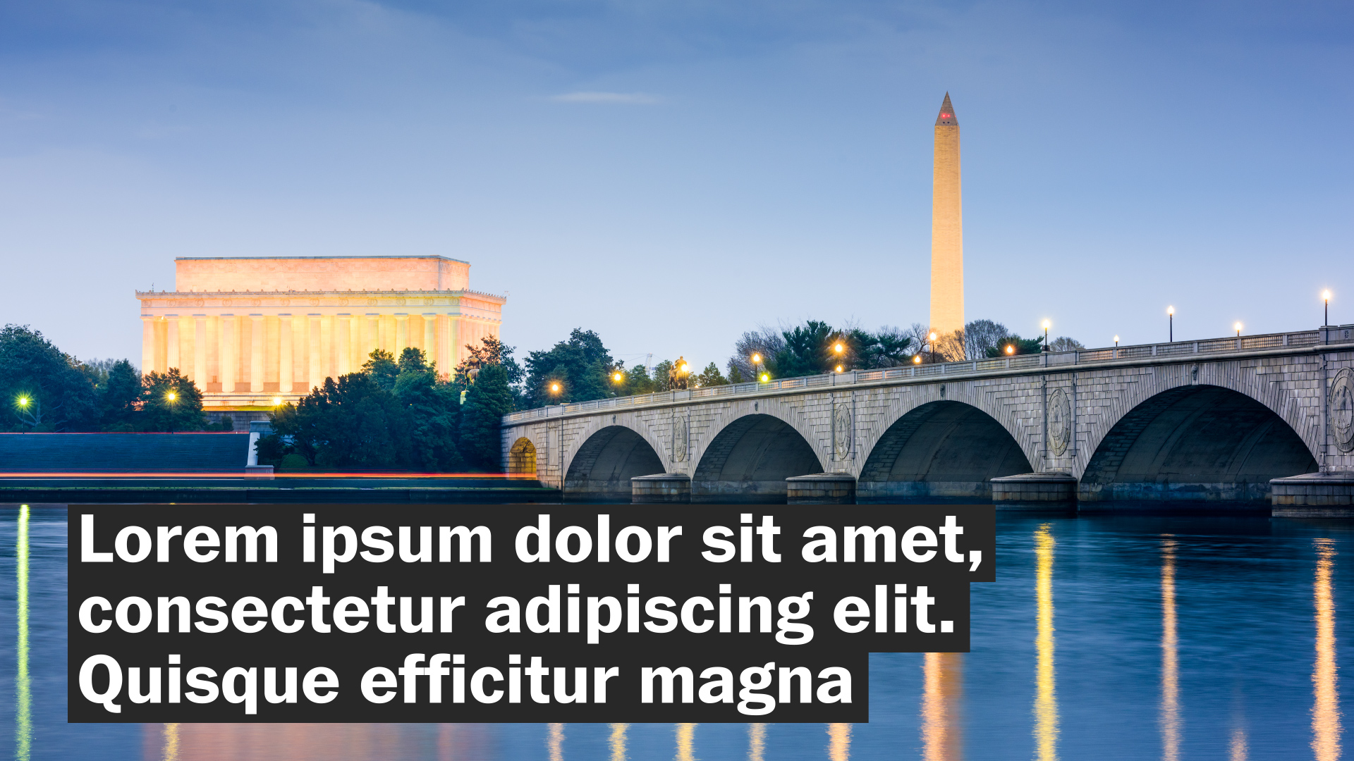
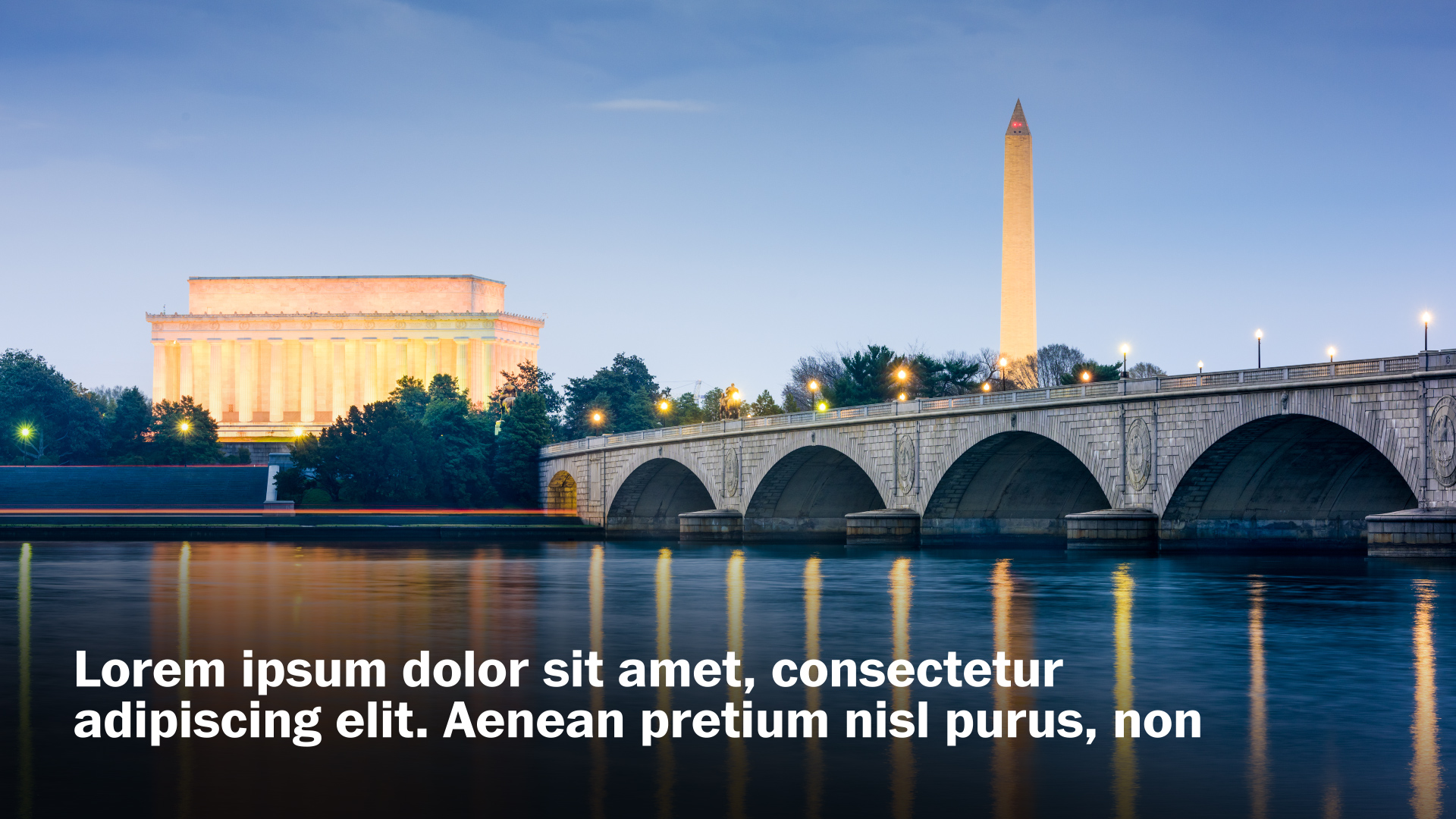


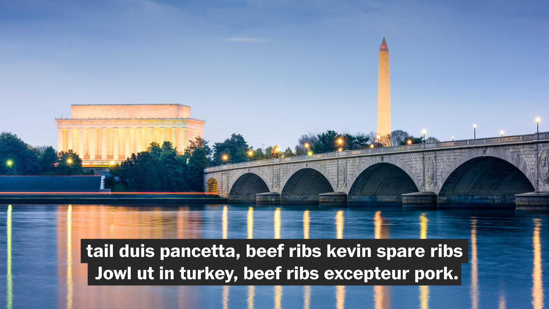

Before this redesign, our previous graphics style was minimal and type-focused. We leaned heavily on our house fonts (Franklin & Postoni) and we tried to keep our approach as simple as possible. The thought was that we wanted to have a graphics package that could stay neutral regardless of the type of video it was used for. This approached worked incredibly well for our Enterprise content (mini-docs), but it didn't do us any favors in terms of brand awareness and style.
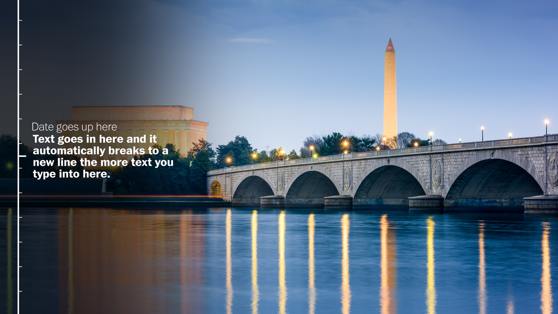
These templates were built inside of After Effects and then imported into Premiere using dynamic link. A lot of the magic was done using scripts inside of AE, namely scripts that dynamically resized boxes or lines depending on the amount of text inputted by the producer.
KICKOFF MEETING
In May 2017, we kicked off this project with an initial timeline of 8-12 weeks. The phrase I used often to describe what I was looking for was "modern heritage". I knew I didn't want to reinvent the Washington Post brand, but instead find ways to modernize it and make it work better for video. We took inspiration from many sources (this, this, this, and many others) but overall what I wanted to see was a clean and modern design that was also distinctly our own.
EARLY DESIGNS


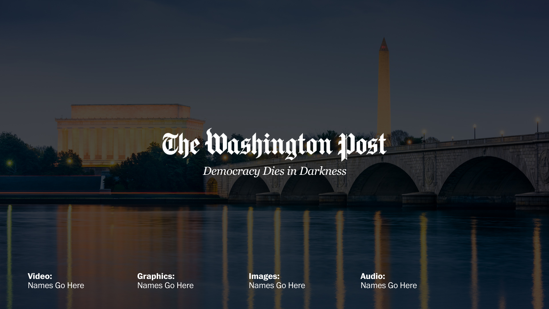
Versus took our initial conversations and came back with some very promising designs. Their main recommendations revolved around a few major points, the first being Post Blue. We have a very specific shade of blue that is associated with the Washington Post. Video wasn't really using it at all. The second recommendation was to stick with our house fonts, Franklin & Postoni. With such heavy usage on the site already, it was in our best interest in Video to replicate that usage. And finally, shortening the logo mark down to WP whenever possible.
ORGANIZATION
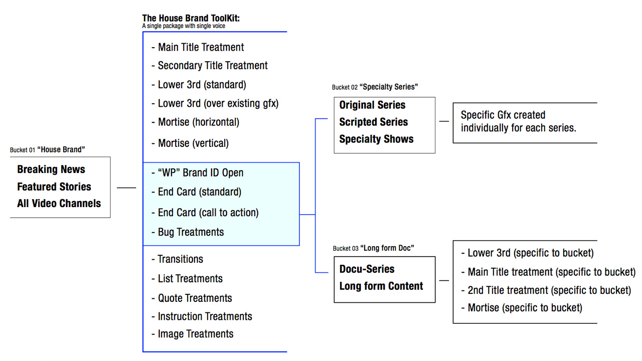
This is the rough breakdown of how assets are organized for different pieces of video content. It was important to establish a strong House Brand (bucket 1) before trying to design for other specific types of content. Once the House Brand was locked down, Versus started work on building out our Enterprise aesthetic (bucket 3) as well as a few franchises (bucket 2). As you can see they all pull from the House Brand in some way giving us that continuity we need.
FINAL DESIGNS


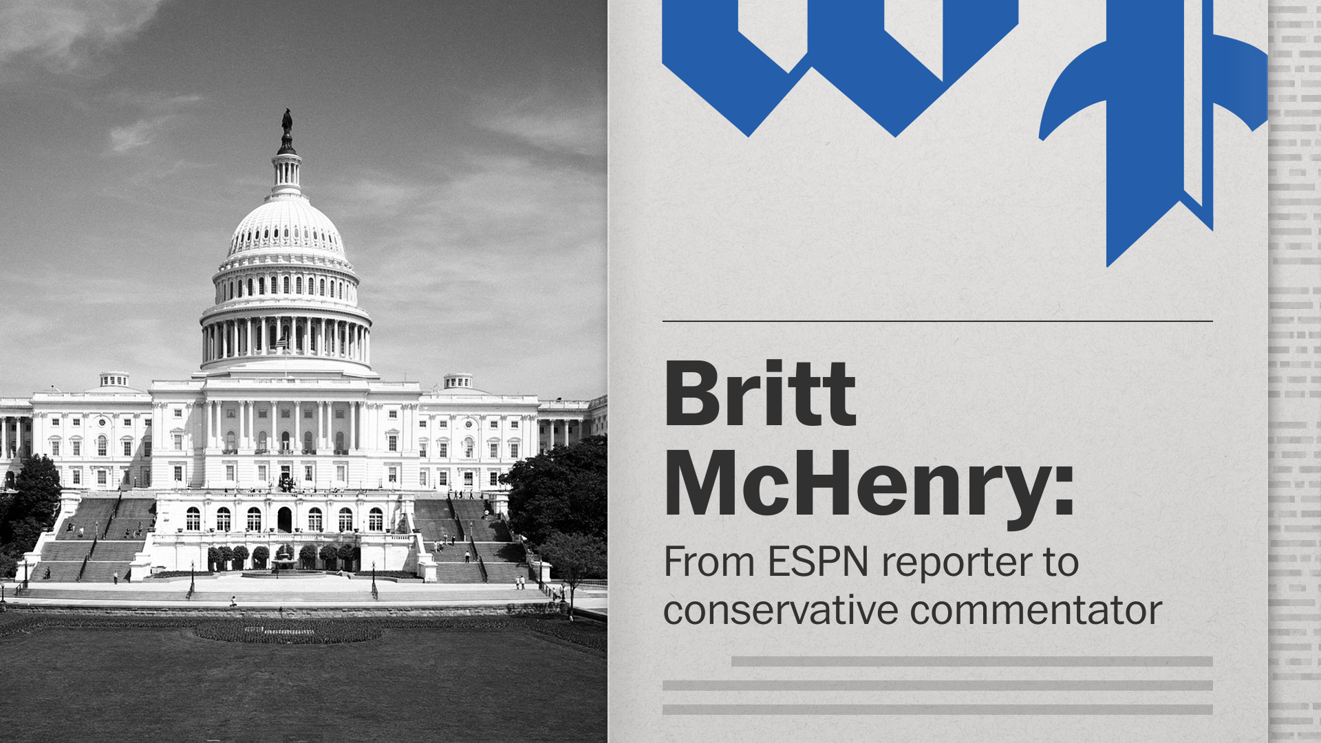


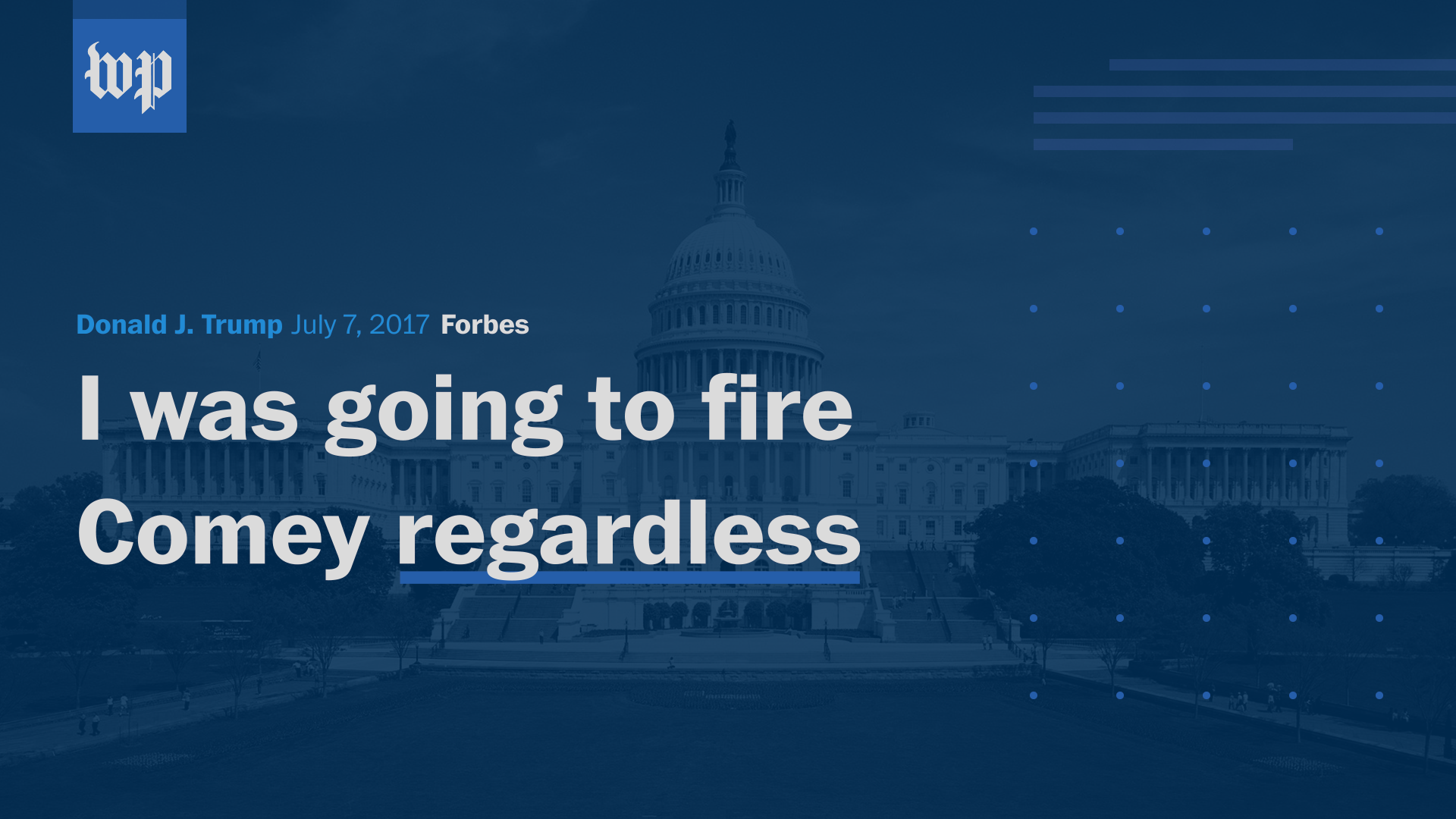
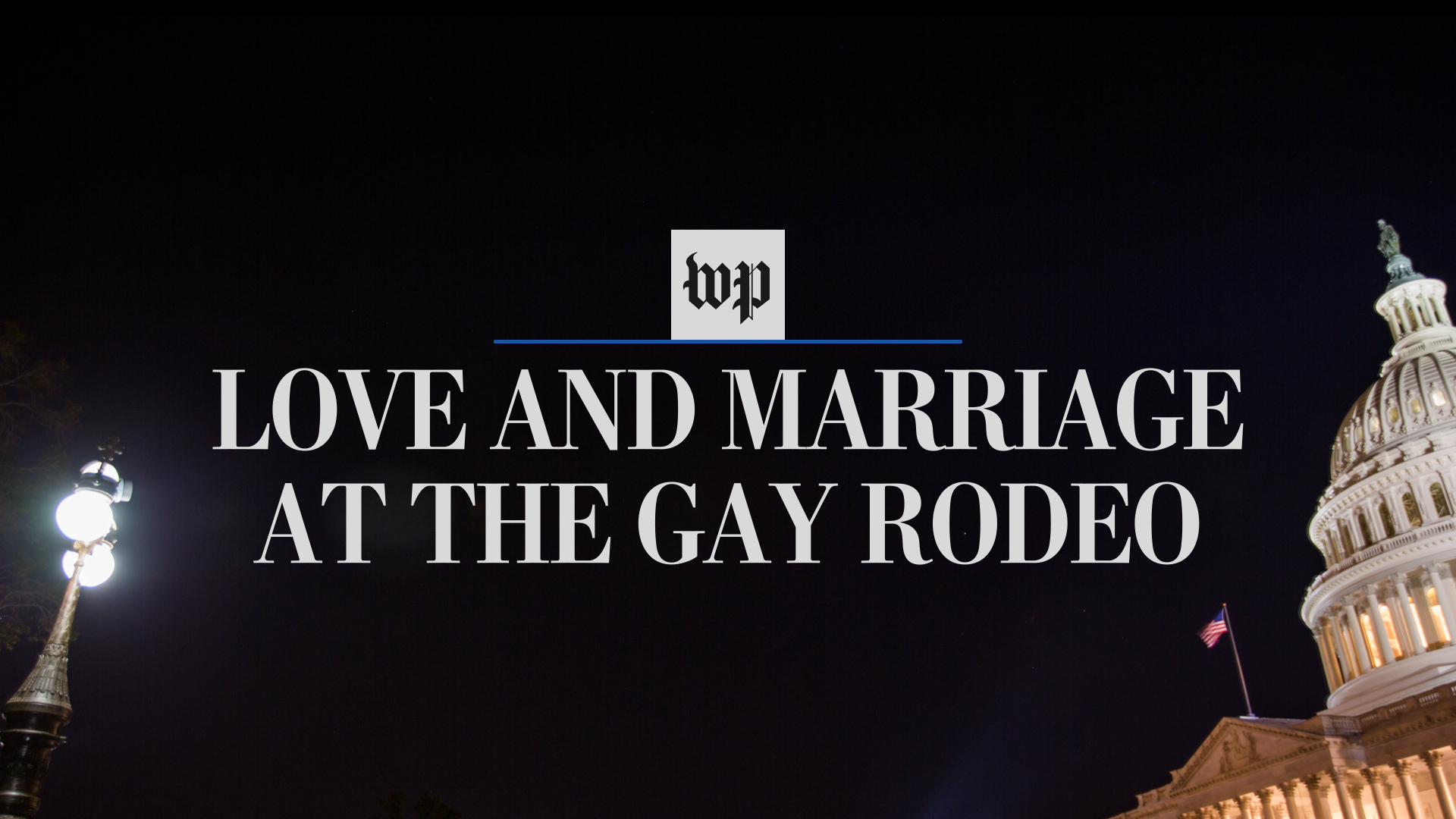
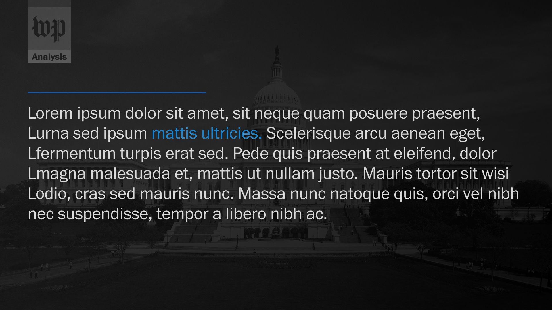


And here it is! These are the final designs for this project. We started rolling out the toolkit to producers in mid-October and have been slowly training them on how to put together packages. My favorite part about this project has been the amount of variety and flexibility we've been able to create in this toolkit while still being able to establish ourselves visually. Obviously this is just the beginning, but its a great place to start.